Framework
Global Presets UI Style Guide
01. Color palette
In this part of the style guide, you can modify each color inside the Text Module’s background settings. Use that same color code inside the Text Module below it to have a written version of the color code too. Use these color codes inside your Divi Theme Builder default color palette afterward.
#f2f2f2
#d8d8d8
#6b6b6b
#141414
#ffffff
#f6f0eb
#5c331b
#342512
02. Text styles
In the second part of this style guide wireframe, you can style your different text types. You’re also provided with a primary, secondary and tertiary option, each of which you can afterwards turn into individual presets.
Primary
Heading 1
Heading 1
Heading 2
Heading 2
Heading 3
Heading 3
Body
Lorem ipsum dolor sit amet, consectetur adipiscing elit, sed do eiusmod tempor incididunt ut labore et dolore magna aliqua. Ut enim ad minim veniam, quis nostrud exercitation ullamco laboris nisi ut aliquip ex ea commodo consequat.
List
- Lorum Ipsum
- Lorum Ipsum
- Lorum Ipsum
03. Modules
The last part of this style guide handles some of the most-used modules inside Divi. Here, we’re also providing you with a primary, secondary and tertiary version of each module which you can style and add as a global preset. Feel free to create more alternative designs for each module.
Primary
Button
Accordion
Your Title Goes Here
Your content goes here. Edit or remove this text inline or in the module Content settings. You can also style every aspect of this content in the module Design settings and even apply custom CSS to this text in the module Advanced settings.
Your Title Goes Here
Your content goes here. Edit or remove this text inline or in the module Content settings. You can also style every aspect of this content in the module Design settings and even apply custom CSS to this text in the module Advanced settings.
Blog
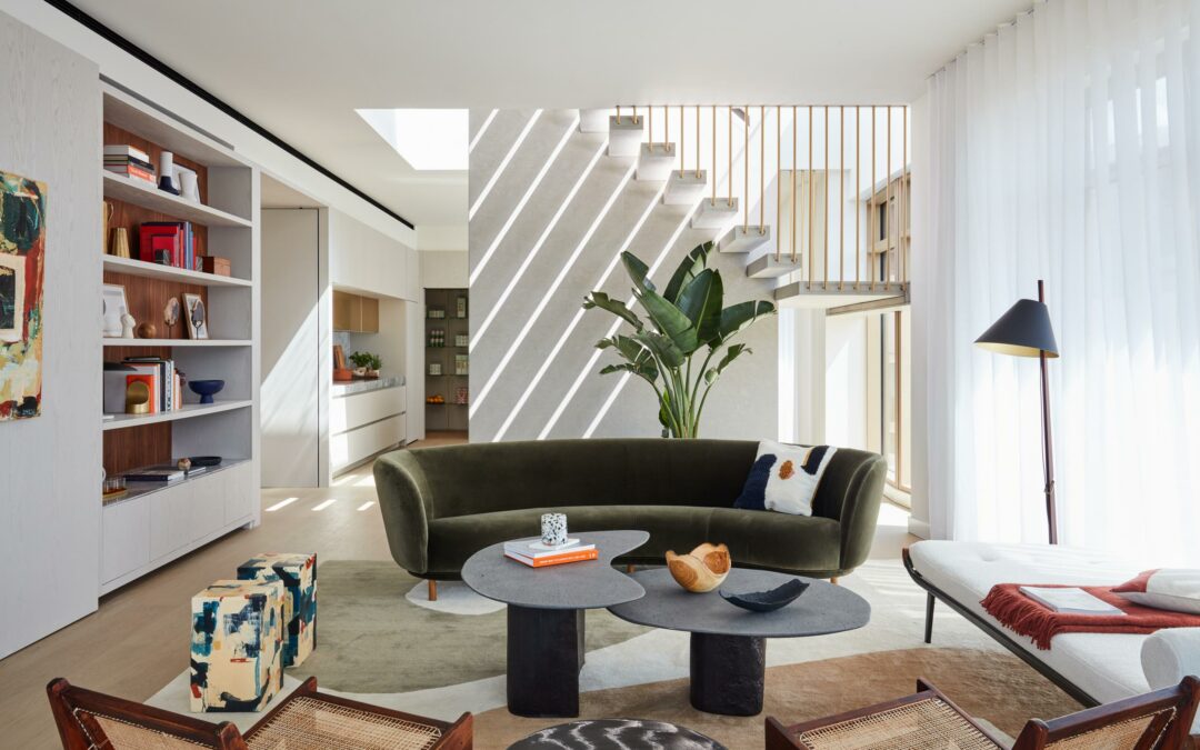
Conran and Partners’ Kings Cross penthouse balances drama and calm
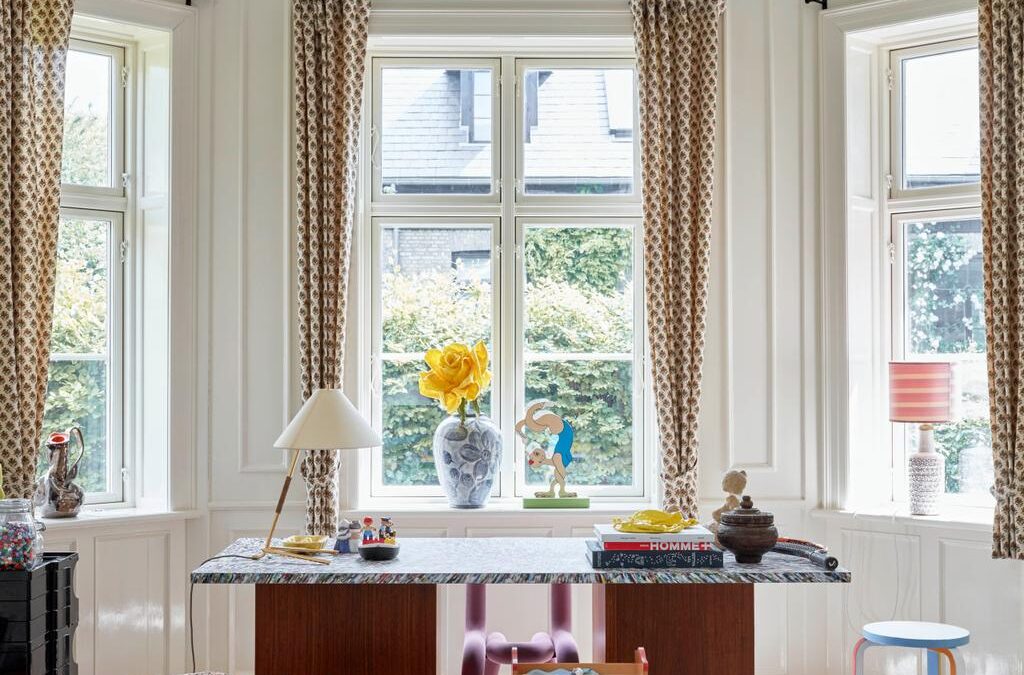
Inside the Copenhagen home of Ganni’s Ditte and Nicolaj Reffstrup
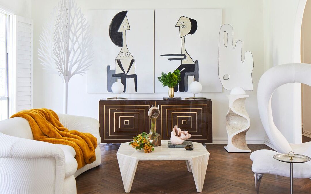
6 decor trends that are even better when sourced secondhand
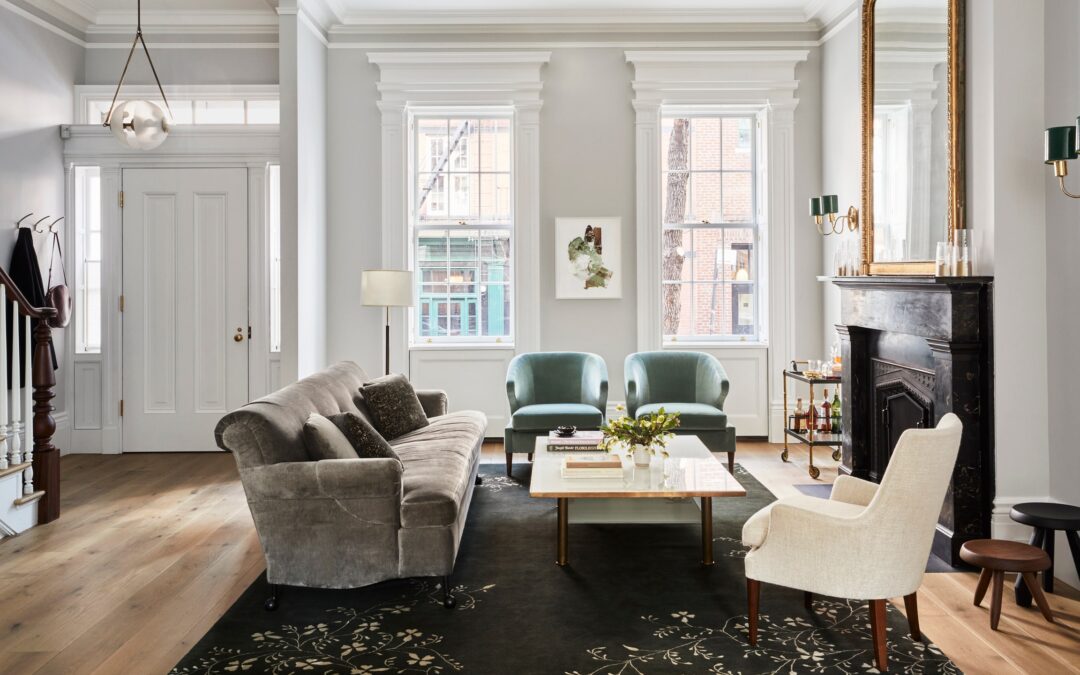
Tour a greek revival townhouse with traditional and midcentury details
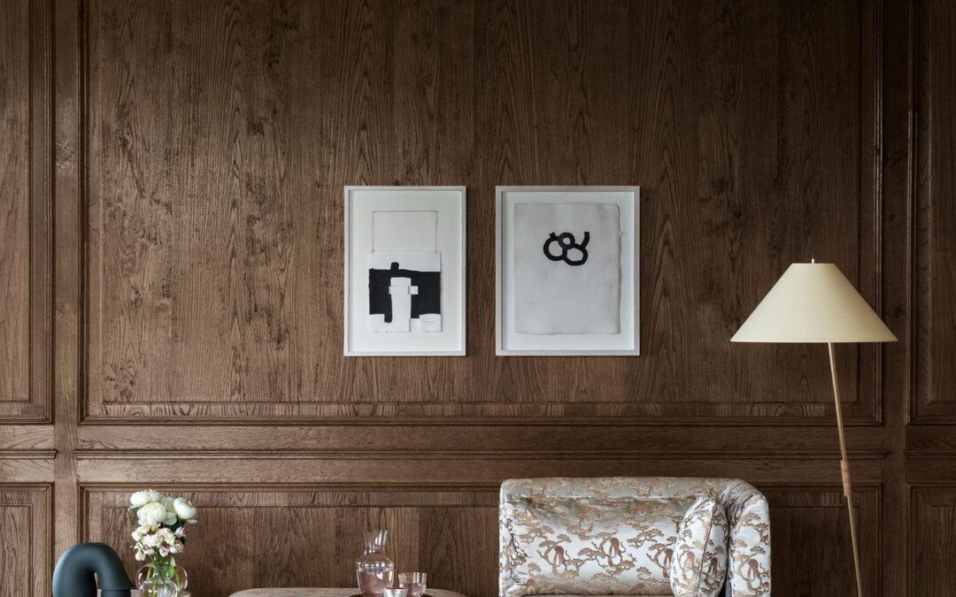
Armani Casa marks 20 years at the heart of the well-considered home
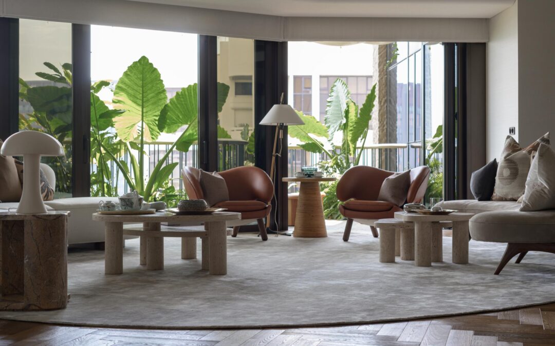
This garden home in Singapore is designed as a plant paradise
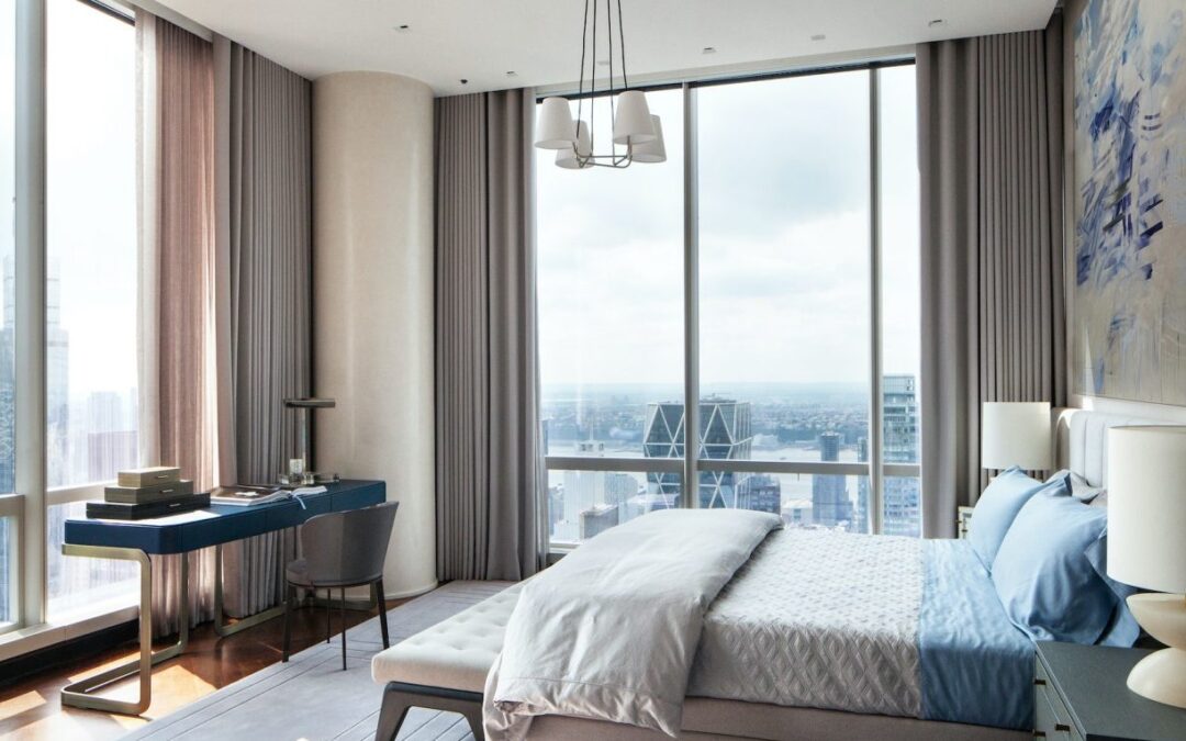
New York: With views of Times Square, Central Park and the Manhattan skyline, is this the perfect Big Apple apartment?
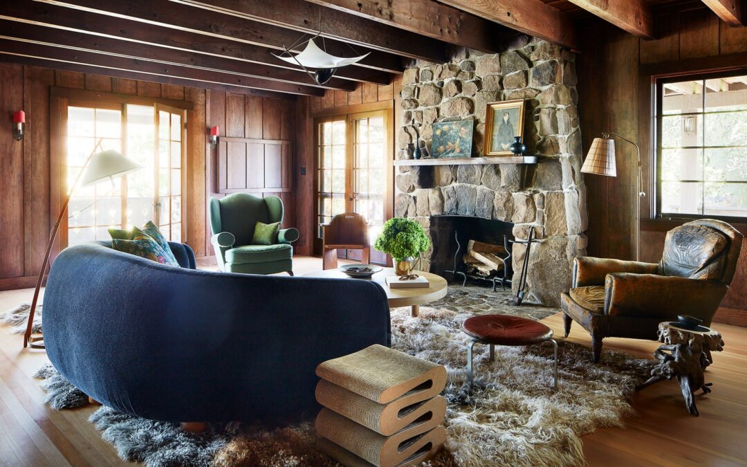
Anne Hathaway and Adam Shulman reveal their California country home
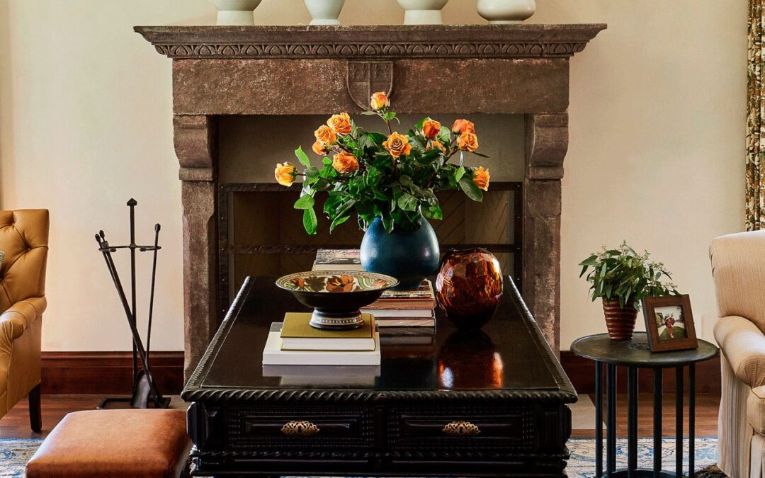
AD’s shopping resources to help you get the look
